Image adapted from JD Hancock's
photo on flickr.
Note: This piece was
originally published at CMSWire.
"I’m getting internal pressure to create infographics. Yes, I know they’ll perform well. But to be honest, I don’t view many myself. As a consumer of content, I’m just not sure I see the value."
I heard this comment at a
Silicon Valley Meetup for content marketers, and it got me thinking about infographics. If we map infographics to the Gartner Hype Cycle, we just passed the Peak of Inflated Expectations. We’re now headed downhill towards the Trough of Disillusionment.
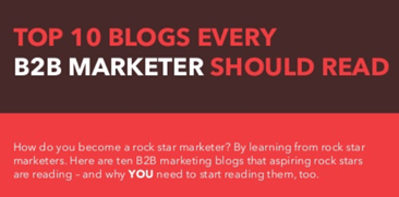
When I got started with infographics at DNN, I helped create an
infographic on top B2B marketing blogs. It received a lot of views, inbound links and social shares, but was organized just like the other infographics published at the time.
There’s an overwhelming supply of infographics, especially in B2B industries. While some are outstanding, most are run-of-the-mill. With supply exceeding demand, creators of infographics must rise above the pack to get noticed.
In this article, I’ll share two examples of innovative infographics and present an idea for a new one.
Directly Connect to Long-Form Content
Typically, organizations publish their infographics by embedding them in a blog post. For a creative approach, let’s consider an infographic that directly connects its key elements to the blog post surrounding it. Have a look at "How to Create Leads [Infographic]" by Andy Crestodina (@crestodina), Principal and Strategic Director at Orbit Media Studios.
According to Crestodina, "the little numbers in the infographic are references from the post. So unlike a self-contained infographic, an 'info-diagram' fits within its context and isn't just for scanning and dismissing. It's for reference."

Source:
Orbit Media Studios.
Crestodina set out to create the infographic first. Soon enough, he realized that the infographic required a lot of detailed explanations and covered many topics. As a result, "the graphic evolved into a diagram with numbers that referenced the text in the post."
Crestodina wrote the blog post and hired a design agency to create the infographic. To create the specifications for the infographic, he used old fashioned pen and paper:
"We did at least three or four versions over several weeks to get it right. The final draft was colored pencil on two pieces of paper taped together. I found myself referencing it in meetings, showing it to people, using it to explain things. If you find yourself sharing a draft of a piece of content with people in person, it's probably going to work well online."
Which drove more engagement, the blog post or the infographic? It depends on each reader. In either case, the combination of the two encourages people to engage at a deeper level. According to Crestodina, the "time on page" for this post was four minutes, which is probably longer than the average infographic.
Deliver a Unique, Interactive Experience
I spoke to Leslie Belknap (@LeslieBelknap), Marketing Director at Ethos3, who shared the "Distance to Mars," a creative, interactive experience developed by David Paliwoda and Jesse Williams.
The page asks you to imagine that the Earth is 100 pixels wide. It then shows how many pixels are required to travel from Earth to Mars. A conventional infographic might be based on an analogy -- e.g., if the Earth were a 100-page book, the distance to Mars would be more pages than all the books in the Library of Congress.
“Distance to Mars” is more innovative. First, you need to click to get started. With that single click, the experience is already more interactive than the typical infographic. After clicking, you see movement (in outer space) and you eventually arrive at the moon.
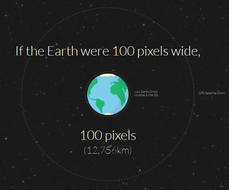
Next, you click again and wait (much longer) to eventually reach Mars. Along the way, messages are presented on the left and right of the page. As you approach Mars, the space travel background slows, to convey that you’re approaching your destination.
According to Belknap, "The visceral impact of the motion, and the overall simplicity of form, beautifully translate information that would otherwise be difficult to comprehend."
From start to finish, this experience took 69 seconds. And I was there for the entire thing. I often don’t make it to the bottom of infographics, so why was this one more successful? It was a combination of the goal and the experience.
I needed to reach a destination, and the presentation hooked me enough to stay along for the ride. In addition, the first stop helped build suspense for the final stop. I kept wondering, "So just how long is it going to be before I reach Mars?"
My Idea: Chop Up the Infographic and Shift the Orientation
Nearly all infographics are presented in rectangular form, with a vertical scroll. They're broken up into segments. While each segment relates to the overall theme, few infographics provide a direct connection from one segment to the next.
Let’s vary the format to provide a more engaging experience.
Here’s my idea: After defining each segment, display them horizontally, rather than vertically. Next, require the user to click to advance from one segment to the next, while creating dependencies across them. Finally, design each segment in the shape of a jigsaw puzzle piece. At the end, show a completed puzzle, along with a concluding message that brings together all of the dependencies.
Let’s say you wanted to create an infographic showing data (and dependencies) related to the California drought. Your flow could be:
- The low amount of rainfall in California, which affects:
- The production of crops, which affects:
- Crop prices, which affects:
- Livestock commodities trading, which causes:
- Swings in the global economy.
The concluding segment could show the explicit connection between rainfall in California and the global economy. Because of the sequential nature of this experience, presenting the content via slides (and published at SlideShare) could be a good solution.
The Future of Infographics
With "How to Create Leads" and "Distance to Mars" leading the way, I hope to see more innovation in infographics. As we break out of the box (or rectangle) of conventional infographics, we’ll begin to ponder whether the term "infographic" still applies. And that would be a good thing.
According to Crestodina:
"I'm watching the use of infographic techniques used at live events, when a person summarizes a presentation graphically on paper as it's given live. It uses a lot of the same principals as infographics (combination of visuals and text to explain bigger ideas) but it's live and offline, which makes it really interesting.
I'd like to see infographics merge with comics, where a character is used repeatedly. I've never seen anyone serialize an infographic, but it could easily be done."
To bring it all together for my fellow Meetup attendee, one thing she could try is an infographic with an action hero trying to reach her destination, inside of a blog post, and presented via SlideShare. That would be a comic worth collecting!